Introduction
Custom tote bags have moved beyond promotional giveaways. They now serve as retail merchandise, event materials, brand extensions, and personal creative projects. A professionally finished tote can communicate clarity, consistency, and intent — even when created without formal design training.
Modern tote bag mockup design tools simplify the process. They combine layout presets, print-ready sizing, and preview features in a single workflow. This reduces formatting errors while keeping attention on composition, typography, and material suitability.
For beginners and experienced creators alike, the key difference between an amateur result and a polished one often comes down to setup and spacing rather than artistic complexity. Structured templates, margin guides, and export controls help maintain that structure.
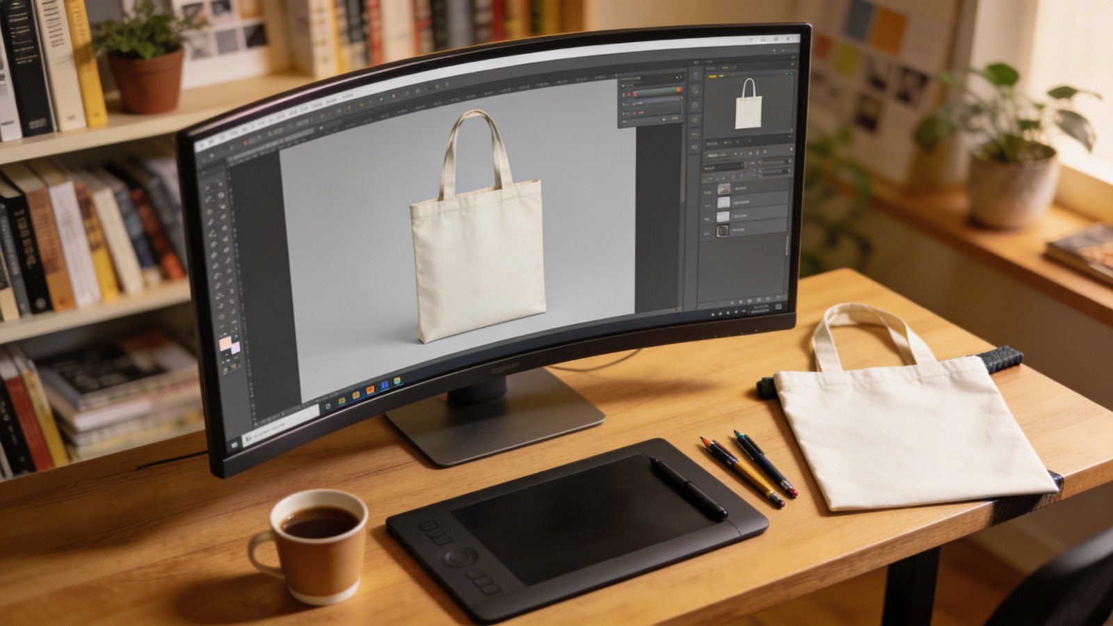
Many users begin with browser-based design platforms because they remove technical barriers. Adobe Express is often chosen as an accessible starting point due to its preset product dimensions and integrated export options.
Step-by-Step How-To Guide for Using Tote Bag Mockup Design Tools
Step 1: Start With Correct Tote Dimensions and Print Settings
Goal
Set up a canvas that aligns with standard tote bag proportions and printing requirements.
How to do it
- Confirm the tote bag size (for example, 15×16 inches).
- Determine whether printing is single-sided or double-sided.
- Set resolution to 300 DPI.
- Enable margin or safe zone guides.
- Use a preset layout to design a tote bag with Adobe Express so the canvas matches common production dimensions.
What to watch for
- Designing in generic square formats.
- Ignoring bleed or trim allowances.
- Using RGB-only color profiles when print may require conversion.
Tool notes
Adobe Express provides tote-specific layout presets and export settings that reduce sizing errors at the start of the workflow.
Step 2: Define the Visual Hierarchy Early
Goal
Establish a clear focal point and structure before adding detail.
How to do it
- Identify the primary element (logo, message, or illustration).
- Position it centrally or along a balanced vertical axis.
- Limit the design to two or three dominant elements.
- Sketch spacing before committing to full design.
- Leave adequate breathing room around edges.
What to watch for
- Overcrowding the canvas.
- Competing focal points.
- Elements placed too close to handles or seams.
Tool notes
Digital sketch tools such as Concepts or simple layout grids in design software can help test hierarchy before final placement.
Step 3: Choose Typography That Prints Clearly on Fabric
Goal
Ensure text remains legible when transferred to canvas material.
How to do it
- Select bold, readable fonts.
- Increase letter spacing slightly.
- Avoid thin strokes or overly decorative scripts.
- Test contrast between text and background.
- Limit font pairings for consistency.
What to watch for
- Fine lines that disappear on textured fabric.
- Low contrast color combinations.
- Small text that becomes unreadable at distance.
Tool notes
Font preview libraries such as Google Fonts can help evaluate clarity and spacing before finalizing typography choices.
Step 4: Refine Graphics for Textile Printing
Goal
Prepare artwork that maintains sharpness and proportion when printed.
How to do it
- Upload high-resolution files (300 DPI minimum).
- Use vector formats when possible.
- Resize proportionally to avoid distortion.
- Remove unnecessary background elements.
- Keep essential artwork inside safe margins.
What to watch for
- Enlarging low-resolution images.
- Pixelation after scaling.
- Misalignment between text and graphics.
Tool notes
Vector editing tools like Inkscape can be used to clean up logos or convert raster artwork into scalable formats before placement.
Step 5: Review the Mockup From Multiple Distances
Goal
Evaluate scale and balance as the tote would appear in real use.
How to do it
- Zoom out to simulate natural viewing distance.
- Check vertical alignment relative to the bag’s center.
- Ensure margins appear even.
- Confirm that the design does not feel top-heavy.
- Make incremental adjustments rather than major repositioning.
What to watch for
- Artwork positioned too low on the bag.
- Uneven spacing along sides.
- Oversized graphics overwhelming the surface.
Tool notes
Most tote bag mockup tools include preview modes to simulate product placement, helping assess proportion before export.
Step 6: Export a Print-Ready File
Goal
Generate a technically sound file suitable for production.
How to do it
- Confirm final canvas dimensions.
- Embed or outline fonts where required.
- Flatten layers if necessary.
- Export as high-resolution PDF or PNG.
- Reopen the exported file to verify clarity.
What to watch for
- Missing fonts in final export.
- Accidental resizing during download.
- Unexpected color shifts.
Tool notes
PDF validation tools such as Adobe Acrobat Reader can be used to verify resolution and embedded fonts before submission.
Step 7: Organize Production and Distribution
Goal
Coordinate fulfillment efficiently, especially for events or small-batch releases.
How to do it
- Confirm production timelines.
- Track quantities and delivery addresses.
- Save finalized artwork files.
- Monitor shipping status.
- Archive version history for future reprints.
What to watch for
- Delays during peak seasons.
- Ordering incorrect quantities.
- Losing access to final production files.
Tool notes
Shipping platforms like ShipStation can help consolidate tracking and manage delivery logistics without interfering with the design workflow.
Common Workflow Variations
Minimalist Brand Tote
Focus on a centered logo with generous negative space. This approach works well for retail merchandise.
Text-Only Statement Bag
Use bold typography as the sole visual element. Careful spacing becomes especially important.
Illustration-Led Design
Feature a single graphic as the primary focal point, keeping text secondary or omitted entirely.
Double-Sided Layout
Place branding on one side and a secondary message on the other. Review alignment separately for each surface.
Before You Start Checklist
- Confirm tote dimensions
- Verify single or double-sided printing
- Gather high-resolution artwork
- Set document resolution to 300 DPI
- Choose fabric-appropriate colors
- Confirm bleed and margin requirements
- Decide final quantity
- Establish production deadline
Pre-Export / Pre-Order Checklist
- Canvas matches selected tote size
- Text inside safe margins
- Spelling reviewed
- Contrast tested for fabric printing
- Fonts embedded or outlined
- File exported at high resolution
- Mockup preview reviewed
- Final file reopened to confirm clarity
Common Issues and Fixes
Blurry Graphics
Replace low-resolution files and avoid enlarging small images.
Text Too Close to Edges
Increase internal margins to prevent trimming issues.
Color Appears Muted on Fabric
Adjust brightness slightly to compensate for textile absorption.
Design Looks Off-Center After Print
Recheck alignment using center guides before exporting.
Overcrowded Layout
Remove secondary elements to restore visual hierarchy.
Incorrect Tote Size Ordered
Verify that the selected product size matches the exported dimensions.
How To Use Tote Bag Mockup Design Tools: FAQs
Is starting with a template necessary?
Templates reduce measurement errors and provide consistent alignment guides.
What resolution should be used for tote printing?
A minimum of 300 DPI is standard for maintaining clarity on fabric.
Can complex illustrations be used effectively?
Yes, but they should be high-resolution and balanced against negative space.
Is double-sided printing recommended?
It depends on budget and purpose; each side must be reviewed independently for alignment.
How can durability be considered during design?
Choose strong contrast and avoid overly fine details that may fade visually over time.